Case study · Gymshark

Ben Francis · Founder of Gymshark · Clips shown without sound
A founder channel that looks like Gymshark
We rebranded the YouTube channel of Ben Francis, the founder of Gymshark, with a complete visual identity system, from colour palette and type to moodboard and thumbnail structure, so a billion-pound brand finally had a founder channel that looked like one.
Gymshark grew by refusing to look like Nike and Adidas. The founder channel needed the same attitude.
The brief
Gymshark is one of the most disruptive brands of the last decade. A billion-pound sportswear company that started with a teenager filming gym content in his parents’ garage, and became a serious challenger to Nike and Adidas.
Ben had been making content for years, and the basics were in place: decent thumbnails, real production effort. But there was no brand unity. Different videos had different vibes, the fonts were generic, and nobody scrolling YouTube could look at a thumbnail and know instantly it was a Ben Francis video.
For a company that grew through social media and YouTube, that was a missed opportunity. The channel needed to feel like Gymshark: premium, modern and confident enough to walk its own path.
What we diagnosed
Before we touched a single thumbnail, we ran a full diagnostic on the channel. The issues were specific.
No consistency
The thumbnails looked like five different channels stitched together.
Generic fonts
Heavy use of fonts like Impact, which belong to the early YouTube era, not a billion-pound brand.
No curiosity
Compositions didn’t tell a story or give anyone a reason to click.
No colour discipline
Without a palette, the channel had no recognisable visual identity.
No signature
Nothing let viewers spot a Ben Francis video at a glance in their feed.
The cost was simple. Ben’s videos were blending in with every other founder channel on YouTube. For a brand built on standing out, that’s the worst possible outcome.
The contrarian take
Most founder channels at this level look the same. Big yellow text, arrows, shocked faces and loud, MrBeast-style thumbnails. In our view, that’s the worst thing the founder of a premium brand can do.
For Gymshark we wanted the opposite: clean, modern, raw, premium. Not loud for the sake of loud. Confident for the sake of confident. A founder channel should look like the company, and Gymshark’s whole story is being different.
The Channel Identity System
This is the framework we ran for Gymshark. It’s the visual identity layer of every channel we build, and it works in four stages, each informing the next, before a single new thumbnail is designed.

Direction
The visual personality of the channel in eight words: raw, minimal, dynamic, modern, sporty, professional, cinematic and authentic. Every designer and editor works to the same brief.

Thumbnail palette
A defined set of named colours, from Lipstick and Aqua to Iron, Riverbed and Iridium, each with a hex code. The same palette on every thumbnail builds recognition over time.

Moodboard
References from premium brands like Dior, cinematic content and sporty editorial photography. No loud YouTube references. It shows the whole team what success looks like before work begins.

Type
One font, one hierarchy, used everywhere. We chose Clash Display: clean, modern and slightly editorial, distinctive without being generic.
Three thumbnails. Before and after. Drag to compare.

 BeforeAfter
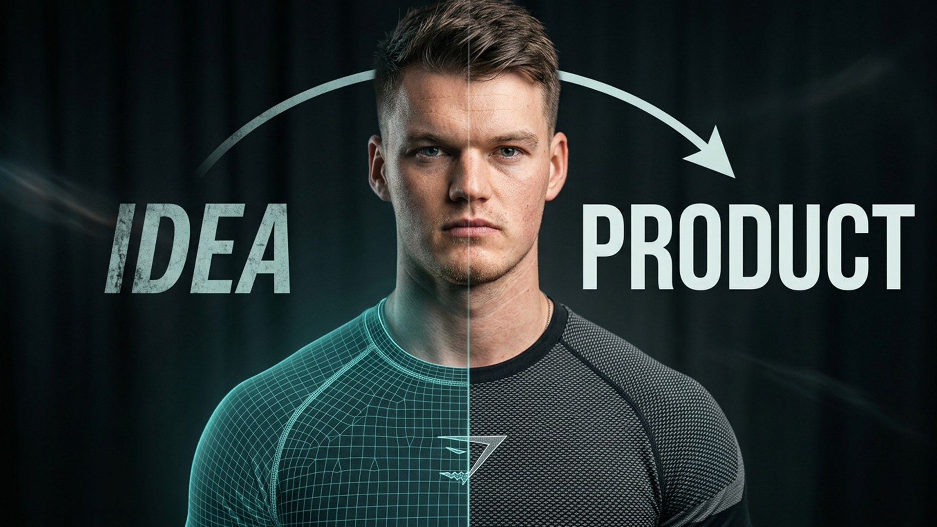
The Rise To Retail
The original used Impact and looked generic. Nothing about it built curiosity.
Our redesign uses a three-part structure: Ben in the middle today, a younger Ben on the left and the product build on the right. Past, present and product. The whole story of the documentary in one image.

 BeforeAfter
Designing A Product From Start To Finish
The original was busy and crowded. We stripped it back, applied the new font and palette, and built a composition that feels premium rather than chaotic.
It looks like Gymshark, not a generic thumbnail with a logo bolted on.

.png) BeforeAfter
BeforeAfterHow A Billion-Dollar CEO Spends His Week
The clearest example of the system at work. The original had no visual identity. The redesign is cleaner, more confident, tells a story and is instantly part of the same channel.
That’s what consistency does. Each thumbnail reinforces the next, until the channel has a signature that’s impossible to copy quickly.
Why a billion-pound founder cares
Ben Francis could ignore YouTube entirely. So why does this matter? In his own words, he’s building a 100-year vision. He wants his children to look back at these videos and watch how he scaled the company, and YouTube is where that record lives and stays watchable.
Founders at this level still have to play the YouTube game, and they can’t afford to look like everyone else. The companies they built grew by being different. Their channels should too.
What we did
This was a channel revamp. We didn’t produce the videos, so we’re not claiming view results that aren’t ours. What we delivered is a visual identity system that gives Ben and the Gymshark team a foundation for the next decade of content.
Recognisable to people and platforms
A consistent identity doesn’t just help viewers. Matching titles, descriptions and visual signals help YouTube, Google and AI assistants understand exactly what a channel is about and who it’s for, so the right videos surface for the right questions.
How we make brands the answer →